
Gapleave App Project
Project Overview
This project explores the design of a customizable self-care and reflection mobile app created specifically for college students. The goal of the app is to help students make time for self-care by providing reminders, activity suggestions, and daily reflection tools in a simple and personalized interface.
Through user research, I discovered that many college students struggle to take breaks and often forget to prioritize their mental well-being while balancing academic responsibilities. This app was designed to address that challenge by encouraging small moments of self-care throughout the day and helping users reflect on positive experiences.
The app focuses on customization and simplicity, allowing users to tailor features, notifications, and visual styles to match their personal needs. Key features include activity reminders, auto-generated self-care suggestions, a daily gratitude journal, and gamified elements such as badges and streaks to motivate continued use.
The final design emphasizes a clean and intuitive user experience that minimizes effort while supporting consistent habits. By combining personalization, reflection, and gentle reminders, the app helps students build healthier routines and maintain a better balance between productivity and self-care.

Problem Statement
College students often feel overwhelmed by academic responsibilities and struggle to prioritize self-care. Many forget to take breaks, eat regularly, or engage in activities they enjoy. Existing wellness apps can feel cluttered, overly complex, or not personalized enough to feel meaningful.
How might we design a simple, customizable app that encourages busy college students to consistently engage in self-care without adding stress to their day?
Research
Research Methods
-
5 preliminary interviews
-
5 in-depth empathy interviews (20–30 minutes each)
-
Affinity diagramming
-
Competitive analysis
Key Findings
-
Students strongly prefer customizable apps.
-
Notifications are helpful — but only if they are personalized.
-
Users want a quick and simple reflection system.
-
Many struggle to think of self-care ideas on their own.
-
Overly complex navigation discourages continued use
A major insight was that students want something that feels personal, not generic. They want an app that feels like it belongs to them.


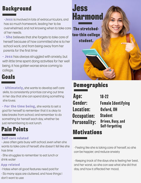
User Persona
Primary User: Busy College Student
-
Juggles classes, extracurriculars, and social life
-
Frequently feels overwhelmed
-
Wants to practice better self-care habits
-
Prefers minimal, aesthetically clean interfaces
-
Appreciates small rewards and visual motivation
-
Values customization and control
This persona guided all design decisions, especially around simplicity and personalization.
Research Findings


Design Goals and Tenets
College students are busy and have little free time.
-
Gratitude journals must be quick/simple to fill out.
-
Must have activities auto-generated to recommend to the user.
-
Make the app easy to navigate for a high user return rate.
Gain the desire to take part in self-care activities.
-
Have a confetti explosion each time an activity is logged.
-
Earn badges from completing and logging activities.
Looking for a personal experience.
-
Provide customizable color scheme options.
-
Provide an option to hide app features based on users' preferences.
-
Ability to customize notifications to fulfill user needs.
-
Personalized welcome message upon opening the app.
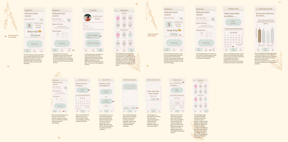
Design Process
Sketches
I began by sketching core workflows:
-
Logging an activity
-
Quick-adding suggested activities
-
Completing a daily gratitude journal
-
Changing the app color scheme
These early sketches focused on structure and user flow rather than visual detail.

Lo-fi Wireframes
I then moved on to design lo-fi wireframes of:
-
Logging an activity
-
Quick-adding suggested activities
-
Completing a daily gratitude journal
-
Changing the app color scheme

High-fi Wireframes
After validating the structure, I created high-fidelity mockups that emphasized:
-
Clean typography
-
Clear visual hierarchy
-
Simple navigation
-
Soft, welcoming color schemes
-
Consistent iconography

Gamified Workflows
Final Product

The final design is a highly customizable, minimal, and motivating self-care app tailored specifically to college students.
It successfully:
-
Reduces friction in starting self-care activities
-
Encourages daily reflection
-
Rewards consistency
-
Maintains simplicity
-
Creates a personal, non-intrusive user experience
Reflection
This project strengthened my understanding of user-centered design and the importance of balancing functionality with emotional experience.
I learned that:
-
Simplicity is more powerful than feature overload.
-
Customization increases emotional investment.
-
Small celebratory moments can meaningfully change user behavior.
-
User feedback should directly shape design decisions.
If I were to continue this project, I would:
-
Conduct usability testing with a larger sample size
-
Develop a working prototype for beta testing
-
Explore integrations with calendar and wellness APIs
-
Test long-term retention impact